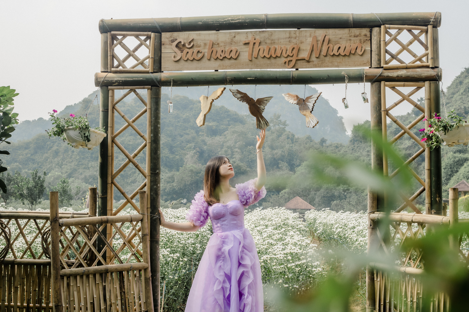
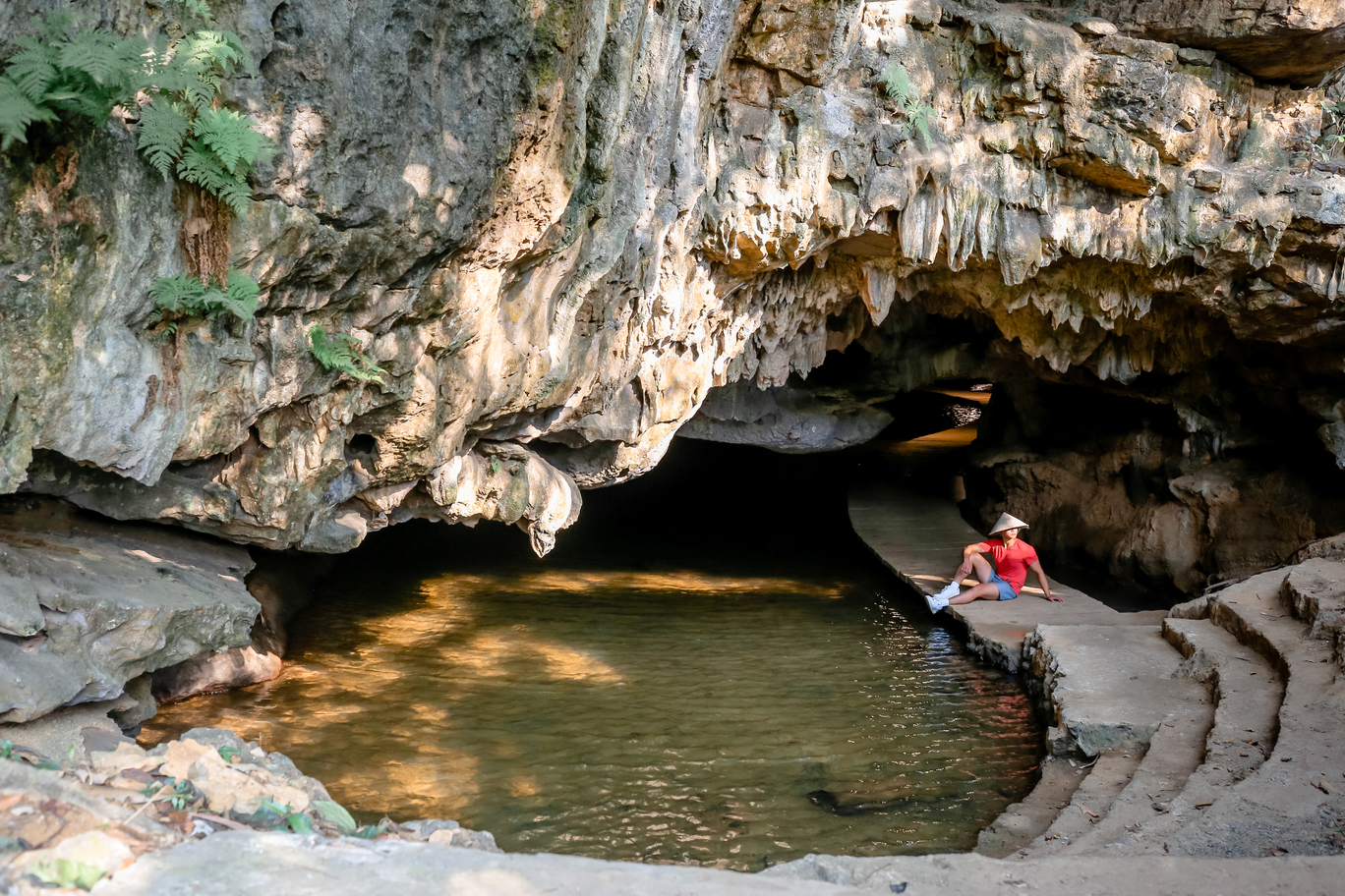
Thung Nham Ecotourism Zone is located in the Hoa Lu Special-use Forest, in the core area of āāthe Trang An World Heritage Complex. With an area of āāup to 300 hectares, Thung Nham has a variety of terrains: from dry caves to water caves, from semi-flooded swamps to primeval forests. Thanks to that, this place has an extremely rich and valuable flora and fauna system that is rarely found anywhere else. Since taking over the management of Thung Nham, the Management Board of the tourist area has always put the goal of preserving and protecting nature first. Thung Nham carries the mission of development in parallel with conservation.
In January 2021, Thung Nham Ecotourism Zone officially changed its brand identity. The new identity of Thung Nham, in addition to the name “Thung Nham Ecotourism Zone”, stands out with the image of a yellow bird spreading its wings and dancing, leaving many impressions on visitors and partners. So, do you know what this logo means?
2. Color:
Thung Nham logo impresses with the image of a golden bird spreading its wings and dancing.
Golden Bird or the Melody of NatureThe design idea of āāthe Thung Nham Eco-tourism Area logo was inspired by the most special feature of the area, which is the largest natural bird garden in the North. The logo is drawn based on the prototype of the Heng Hac bird – a rare bird found in Thung Nham. Since ancient times, in the concept of Vietnamese people, the Heng Hac is a bird that often appears next to the gods, representing purity, longevity and luck. Therefore, among thousands of birds of 46 species residing in Thung Nham Bird Garden, the Heng Hac was chosen as the representative bird.
The image of a golden bird spreading its wings softly as if it were flying up – expressing the desire to move forward, constantly developing and enhancing the value of the tourist area. On the other hand, with its feet cleverly stylized into musical notes, the bird seems to be dancing and singing to its fellows, all in harmony creating a symphony in the middle of the vast mountains and forests, true to the name “Thung Nham – a tropical symphony”.
A closer look will show that the bird’s wings are shaped like leaves, symbolizing the most valuable asset of Thung Nham, which is the rich and prosperous natural ecosystem. With 109 species of plants and 150 species of animals, many of which are rare and listed in the Red Book, this is truly a priceless resource that Thung Nham has been given by Mother Nature and needs to be protected.
Similar to the metaphorical meaning of the leaf in the bird’s wings, the words “Thung Nham Eco-tourism Area” are chosen in green to further emphasize the ecological and natural nature of the tourist area. The dark green color helps to harmonize with the overall color scheme of the logo.
The stylized bird image is chosen in gold color from the history of the formation of the tourist area. When it was first reclaimed, Thung Nham was originally a farm economic model. This place used to be a large-scale farm with rice fields, flower gardens, fruit forests, etc., bringing high productivity and quality. Because it comes from the agricultural sector, for the tourist area owner, the “land” element has an extremely important meaning. In the five elements, “land” is Earth – corresponding to the dark yellow color. Combined with the Gradient color transition effect, it creates a luxurious, smooth, and graceful metallic feeling.
The logo of Thung Nham Ecotourism Zone is designed simply, but contains many profound philosophies. It ensures aesthetic, soft, and lively elements, while conveying the message and ideals of the Management Board of the Resort. Above all, the logo represents the vision and orientation of Thung Nham Ecotourism Area to become the top ecotourism resort in Ninh Binh.

 Zalo Video: Khu du lį»ch sinh thĆ”i Thung Nham